
The issue’s Scientific journal cover design:

Just a short sneak peek into science over the scientific journal cover design: The contrast between the hollow skeleton walking, and the black background is amazing! Notably, we like how the skull covers the first ‘e‘ in Science, still allowing the letter to show. The text, the stress on “walking“, in the title of the paper with the bold white font sits very well with the skeleton. All and all, this is a well thought-out cover, characteristic of the Science magazine.
Now, our selected paper
In situ photocatalytically enhanced thermogalvanic cells for electricity and hydrogen production
TLDR: Wang et al. showed combining photocatalysts with thermally-active redox ions improves the output power to 82 millivolts per degree kelvin while generating hydrogen as byproduct.
Analyzing graphics
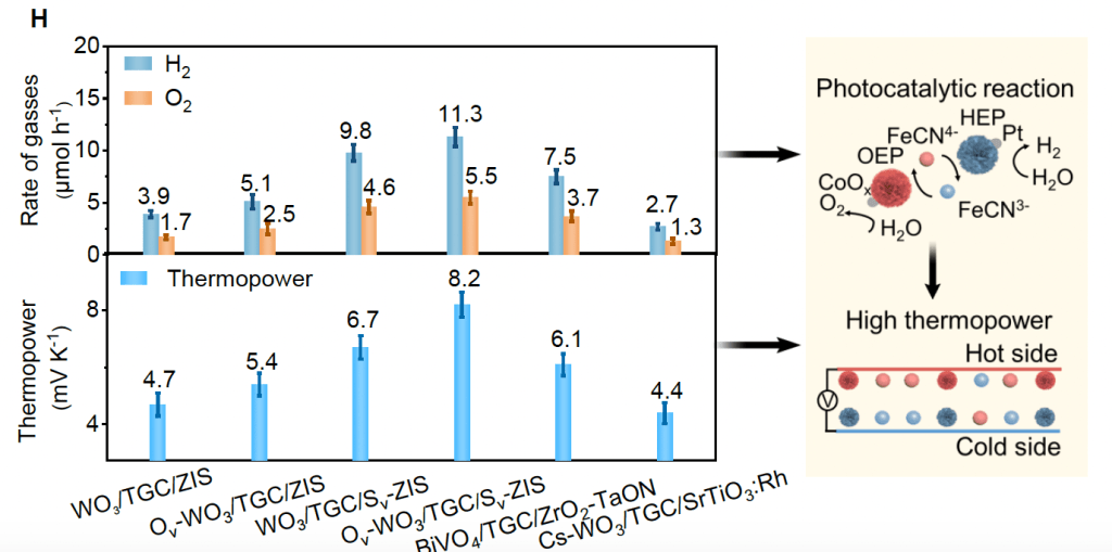
What follows are select figures from this science paper. Based on the concept, authors brought some modern-looking graphics. They used with a warm selection of color, orange and faded Navy, to contrast heat and cold electrodes and particles. You can see the same approach in Figure 1C and Figure 1G. Here they have intentionally avoided using bold colors to ease the focusing pressure on the eyes.
Figure 1

What comes next is the third figure of the paper. Here, the direction of electrons is depicted quite well in Figure 3A. Still, the amount of data they have tried to press into Figure 3B and Figure 3C is little bit too much. This might cause ambiguity for a person not full familiar with the concept. In our opinion, the mechanism is too significant to be compressed in a row of three relatively small figures. In other words, it pays if you dedicate a larger figure that encompasses the mechanism with all or the most important species. Then you can include a smaller figure to include the potential numbers or just bring them in the text. All and all, if the audience get the hang of the mechanism, it is much easier for them to assign the species with the corresponding numbers.
Figure 2

They have better figures demonstrating the science of the mechanism, but they took the backseat seating in the supplementary file. One such figure is Figure S23, brought below. Although it can still be improved, it is a better dissection of the proposed mechanism.
Finally, while the Figure 4 follows the same theme as the previous figures, the A and D segments a stand out as they depict the prototype they built to show their proposed mechanism at work. There is great interest in showing a prototype of your work, if you are aiming for a high impact journal. In other words, this is a great chance to showcase your work. This is the chance that in our opinion, Wang et al failed to grasp. Their demonstration seems like an afterthought, with little attention to detail for a figure in the main text posed to be published in the Science journal. More details, maybe even a larger photo, would have been more impactful.
Figure 4

Verdict
The science paper by Want et al is a good example of proper selection of color pallet and contrast for diagrams. However, it struggles to clearly depict the mechanism that is the main focus of the paper. One smaller area of improvement can also be the depiction of the prototype, which is usually the most interesting section for the non-professional audience. This segment fell short of flashing out the prototype, which might undermine the impact of the paper in public scientific outlets. Overall I have to say I enjoyed the scientific journal cover design very much!
To read the paper, see the following link.
https://doi.org/10.1126/science.adg0164
See other sections of our sneak peek into science series here.